Poets & Writers is the nation’s leading nonprofit organization for creative writers. Since 1970, Poets & Writers works to support and provide opportunities for upcoming creative writers in order to sustain a vibrant culture. Through their vast network of resources, Poets & Writers offers a variety of services including literary events, classes, and writing contests to new and upcoming writers wanting to break out into the creative literary world.

Generic
Overused logomark
Unremarkable
Despite their size, their branding remains lackluster and disappears into the background in face of newer, contemporary brands. Their main branding, the ampersand, comes off as generic and can be easily confused with other brands using the same icon.

Unique
Timeless
Creative
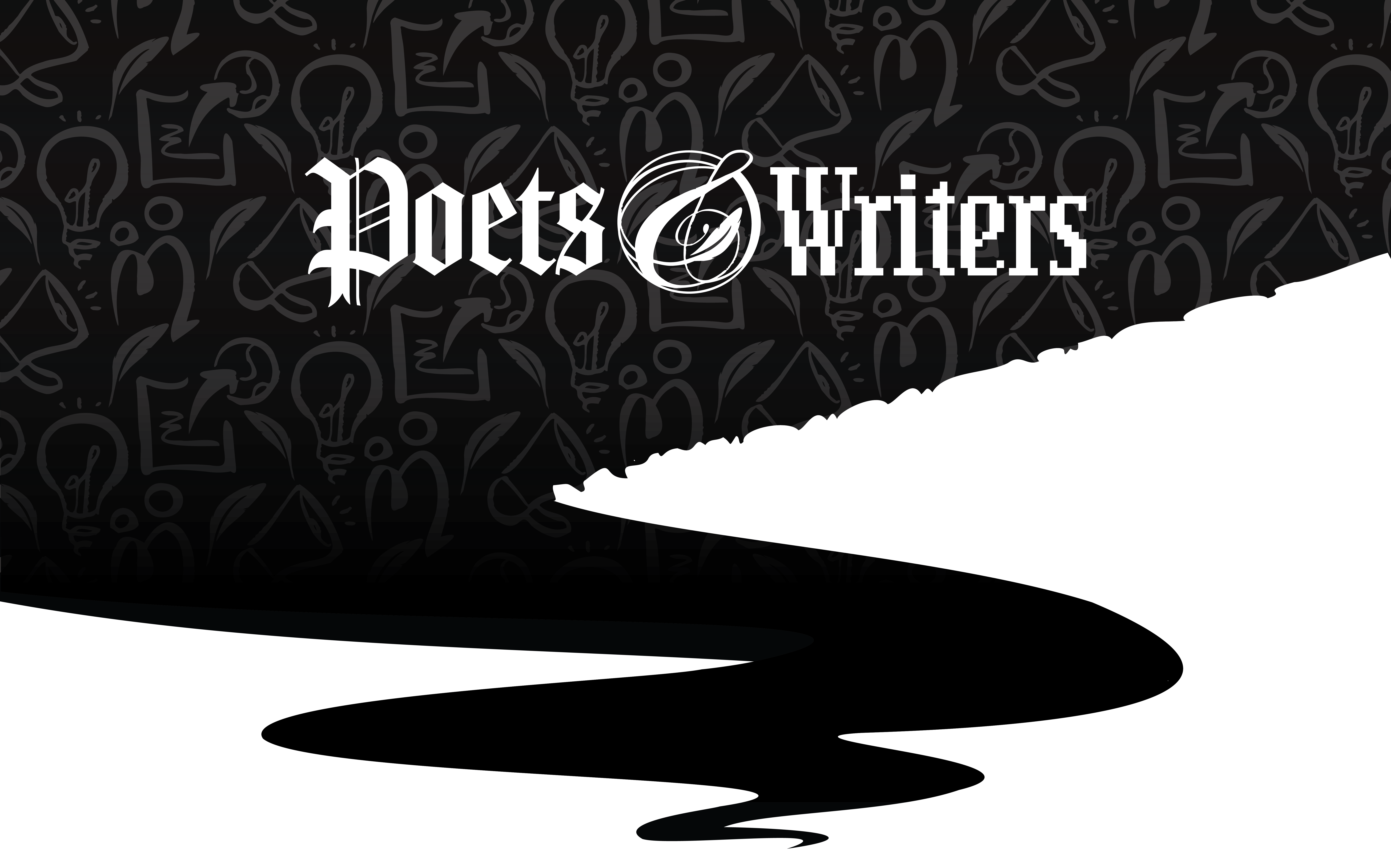
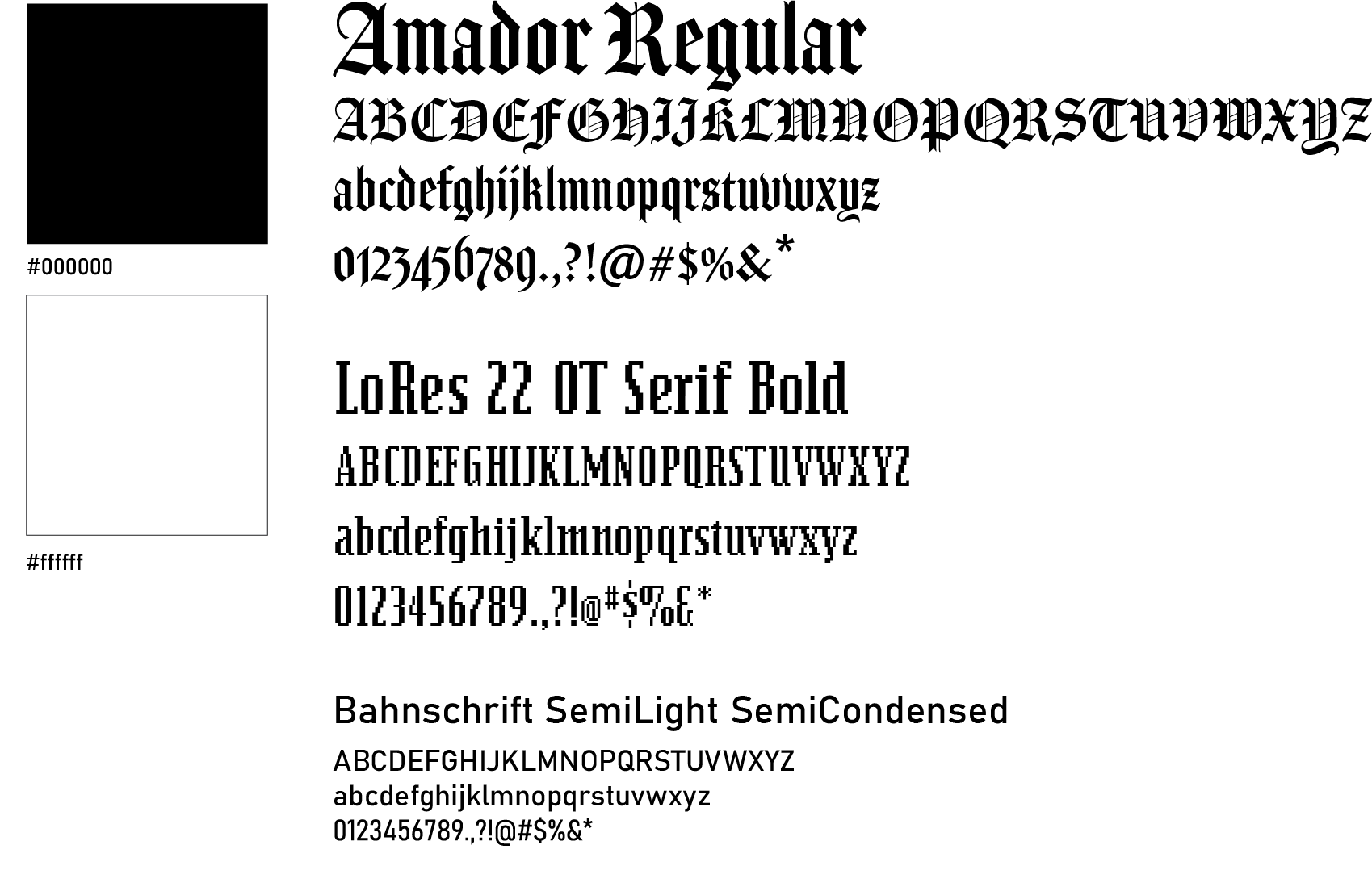
Utilizing blackletter with a pixelated low-resolution font, the combination of the two represents the merging of the old and new world and the age-old history of literacy. The calligraphic ampersand wraps around itself in a circle representing community and unity.


The new logo allows for the ampersand to be displayed front and center and suitable to be displayed on web, print, and icon applications.

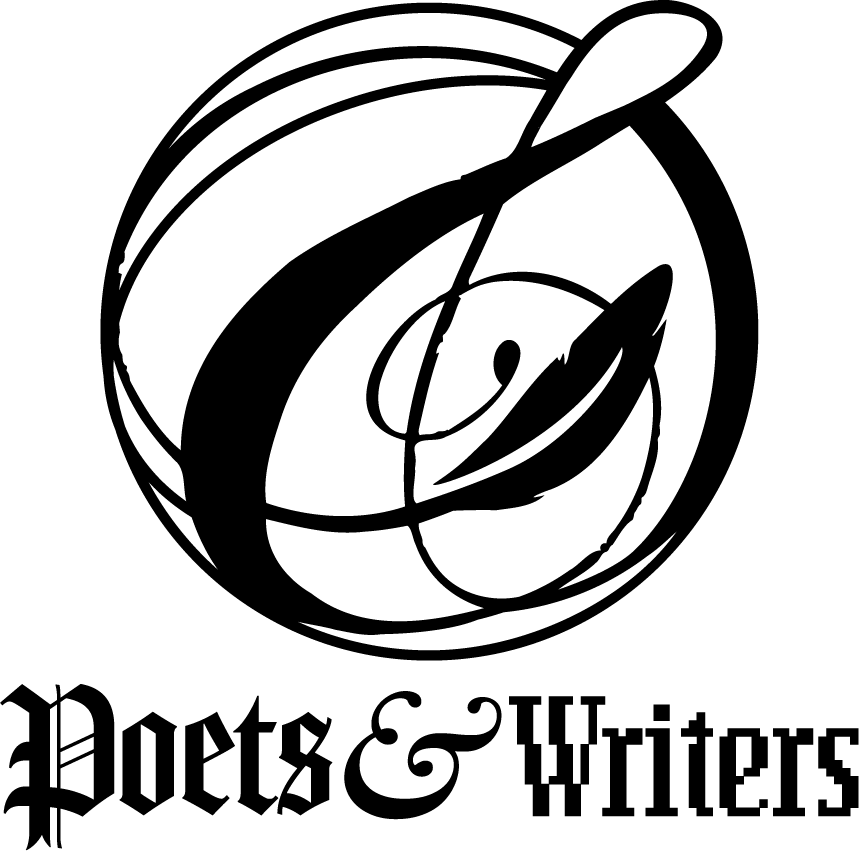
An alternate logo can be used to portray a more simple use of the brand, focusing solely on typefaces used.

Four sub-brands centered around the four key resources Poets & Writers offers were made to better highlight their main goals.

Patterns expanding upon the quill in the logo and the sub-brands are made to create subtle visual interest in the brand.
Colors are kept to simply black and white to spotlight the writers and their works.


Magazine, web, and social media applications were redone to show how the new branding creates a unique, distinguished brand language that properly highlights the resources Poets & Writers offers.